Designing better avatars
01 May 2017
The quest for better online identities needs a more creative approach.
![]()
In a world that is increasingly digital, human connections are as likely to happen online as offline. Social apps play a crucial role in society’s evolving norms around identity, and one component of this is the imagery used to represent individual users on various platforms, generally known as avatars.
Since this is a favorite subject of mine, I decided to create an all-in-one guide to better avatars. This article covers some common missteps, shows why good avatar design matters, and lays out real-world examples of better avatars in action.
Why should we care about avatars and inclusivity?
The earliest use of the term avatar in a computer game was in the 1979 role playing game _Avatar _by PLATO, which was inspired by earlier versions of dnd. The first time it was used as a term to represent the user’s identity onscreen was in Ultima IV: Quest of the Avatar in 1985.
Now, in addition to games, avatars are a staple on social media and other virtual platforms. Avatars are often used to help people visually organize comment threads without having to keep track of an individual’s name, or to provide a placeholder identity for users who haven’t uploaded their own personal representation.
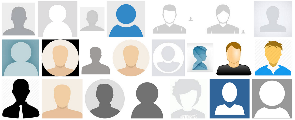 Image: Google image search
While this goal of humanizing online communities with human-like iconography is good, platforms have almost exclusively started off with very male and often white-typed imagery. This may seem like an understandable early solution to an empty state, but the use of white male avatars reinforces the idea that this identity is the norm. These assumptions can lead to real-world outcomes that are detrimental to people who have subdominant identities. More on that in a minute.
And while designing good avatars can seem unnecessarily complicated, there are some theories that suggest that more inclusive approaches to avatars in digital spaces can improve gender and race equity in the non-virtual world.
The myth of a gender neutral default
Often, in an effort to make avatars gender and race neutral, platforms will opt for a less realistic grayscale default.

The problem is, in modern Western society the default is still male. Actor is the default term for anyone in the performing arts, while actress is specifically female. You guys can reference a multi-gendered group, or even a group of all women, but ladies or girls is considered derogatory if men are included. There’s even an entrenched trend where female characters like Ms. Pac-Man are primarily a spin off of their more famous male counterparts, and are defined in relation to the male character and with feminizing gendered signifiers. Adam and Eve, anyone?
This tendency to view men’s bodies, thoughts, and experiences as more normative than women’s is a phenomenon called androcentrism. Even in contexts that we think of as being gender and race neutral, andro and eurocentric biases lead to detrimental outcomes in medicine, business, and education — and in online communities.
It’s not a simple fix
One solution a lot of companies try, understandably, is increasing the usage of female-typed avatars and iconography. After using a clearly male placeholder avatar for a number of years, Facebook created a female default for its female users around 2010. The company also did some work in 2015 to make female iconography more prominent on the platform, although they continue to use very caucasian-looking hairstyles and colors.
 Facebook’s feminist makeover (source)
While this seems like an intuitive way to combat androcentrism and contribute to a more equal society, a study found that increasing female iconography actually heightens the likelihood that people will reference a man when asked to describe a typical person. This is due to a phenomenon known as System-Justification Theory (SJT), where more minority-typed images constitute a system stability threat. Not only does this perpetuate gender and race stereotypes, it can result in higher levels of victim blaming and the perceived normalcy of underrepresented groups not belonging in certain spaces.
In addition to gender, many platforms create avatars that imply that the default is white. Not only do most video games restrict custom avatar features to only white characteristics, violent games that use black male avatars have the very real-world result of increasing white players’ assumptions that black men are more violent. In addition to this effect on white players’ biases, the dominance of white-typed avatars in games like Second Life result in identity threat by individuals who identify as non-white. The use of white avatars can result in “lower levels of sense of belonging and intention to participate” in online communities. Growth hackers, take note.
And then there’s the fact that updating your platform’s avatar won’t increase inclusivity if you aren’t fixing problems at a fundamental level. Twitter has a 10 year history of completely failing to deal with harassment on its platform, so its recent attempt to make a gender neutral avatar resulted in eye rolls and serves as proof that the entire company is tone deaf on these issues.
If a generic avatar is supposed to represent diverse individuals, there’s basically nothing you can do with a human silhouette that won’t be problematic.
Ideas for better avatars
If human silhouettes are out of the question, what’s a platform to do? I rounded up real-world examples of better approaches, and provided some recommendations for what context makes the most sense to use them. Not only are these examples more inclusive, they are often more effective, on-brand, and delightful than a generic human silhouette.
Identicons
 Github identicon style (source)
What is it? Identicons are unique geometric patterns generated based on a hash of a user’s IP address. They were invented 10 years ago by Don Park, who wanted to find a way to provide anonymized online identifiers that were less text or number-based than the status quo at the time. Identicon visuals were based on 9-block pattern generators and quilting patterns, and can create around a billion unique fractal patterns. These avatars have the potential of being very secure while still anonymous; a change in pattern can help users can identify compromised accounts coming from unfamiliar IP addresses.
Examples: There are some fun examples of different websites that use identicons for comment threads. Github generates an identicon for any user without a set image for their profile, although it’s based on a hash of the user’s ID rather than IP address. While Gravatar, which stands for g_lobally _r_ecognized _avatar, used to just have some rather bland placeholders like a “mystery man” silhouette or their logo, they’ve since added options like identicons for any site with a Gravatar integration. Stack Exchange forums are a good example of Gravatar identicons in action.
 Github comment section (source)
Ideas for when to use: At a glance, identicons can lean a little nerdy and confusing for less technical people. But because of this, identicons are a nice addition to more professional and programming-related platforms, where users won’t be as confused by random geometric images. The fact that identicons can be uniquely generated based on a user’s IP address can further reassure more technically-savvy people about the security of a site. Increasing trust while decreasing the ostracism of specific groups — a win!
Animals
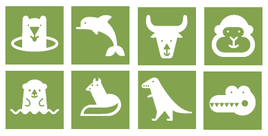
Anonymous animals in Google Drive (source)
What is it? Using representations of animals in place of humans.
Examples: Google Docs assigns an anonymous animal to users who are viewing a document with a link instead of a direct invitation. In addition to expected animals like penguins and otters, there are also extinct or mythical animals including chupacabras, jackalopes, and quaggas. If you’re lucky you can even get a nyan cat.
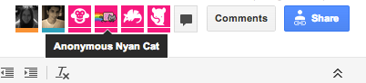
Nyan, nyan, nyan (source)
An interesting point to note is that users actually can’t tell what their own anonymous animal is, relieving potential issues with bad matches.
Virgin America also uses a combination of what I’ve been calling “blob monsters” and animals to represent users, which I’ll cover in more depth in the “aliens and monsters” category.
Ideas for when to use: You have to be a little careful with animals. JIRA allows users to choose from an array of human characters and animals, but the fact that there are more animals than female or minority characters is a reminder that thoughtfulness is important with all these alternatives.
When used thoughtfully, animals can add a playful element to otherwise mundane products, which encourages engagement. They can also be useful in contexts where you want to distinguish between users but don’t need to reveal a user’s actual identity. Because unique animals are so fun, it’s probably not a great avatar solution if you want to encourage users to upload their own photos. Why would I upload an image of myself when I can be an Axolotl?
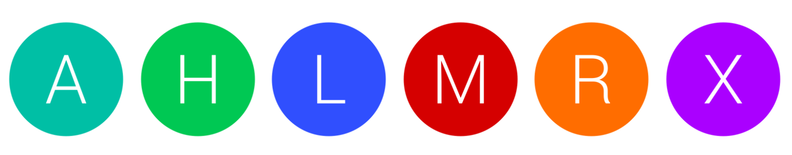
Initials
 (Source)
What is it? Displaying a user’s initials and a unique color in place of a generic silhouette.
Examples:

Google made this change in 2015 (source)
Probably the biggest company to make the switch from humans to initials is Google. Android platforms tend to display user initials with a unique background color. Depending on what information is available from the user, Google will display the first or last initial, both, or if the user’s given first name is only two letters it will display that in full. There are versions of this for non Latin-based languages, although I couldn’t find an example to show.
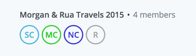 Dropbox represents users with their initials and a unique color (source)
Dropbox has a similar system, as does discussion platform Discourse, where users with no uploaded photo will be represented across the platform as initials with a unique color.
Ideas for when to use: Initials are a good way to provide identifying information when no profile image is present. Pairing initials with a unique color can help visually organize comment threads at a glance and provide extra context as to who is commenting.
Smiley faces

Left to right: Vimeo, Dropbox, Yahoo, Twitter
What is it? A friendly face that looks less realistic than a human silhouette.
Examples: This one actually seems like the most popular alternative. While some of these examples are currently in use and some have been replaced with other solutions, companies including Dropbox, Flickr, Twitter, FriendFeed, Vimeo, Google, and Yahoo have all used a smiley icon as a default avatar at one time or another.
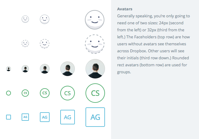 The Dropbox default avatar system, by Dan Eden on Dribbble (source)
One drawback to initials is that because they are already personal identifiers, their use might actually reduce the incentive to upload an actual photo. While Dropbox uses initials when representing an individual to the greater community, they tested a “faceholder” as a way to encourage users to upload their own photo and found that it outperformed initials. Even though only the user sees a smiley face as their own avatar, designer Dan Eden said a few things contributed to its better performance: the cute factor made people want to interact with it, the dotted line gives it a placeholder look, and it’s less a representation of the actual person than initials are. I think they’d improve the feeling of inclusivity if their smiley face wasn’t white, but it’s an interesting direction to take avatars.
Ideas for when to use: When you want to encourage the user to upload a unique image but still want to humanize a product in its empty state, smiley faces can be a cute and playful way to encourage actual photo uploads.
Aliens and monsters
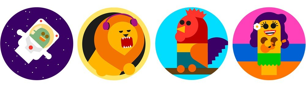 Virgin America avatar set (source)
What is it? Multi-colored monsters and aliens can hint at human emotions while feeling very separate from individual human identity.
Examples: My favorite example in this category is definitely Virgin America. The airline uses on-brand characters to represent users during the seat selection step, which really enhances the entire process of doing something as mundane as booking a flight. Here’s a video showing animated versions of the characters, and you can see the seat selection feature on Virgin’s website. I’ve been calling these “blob monsters”, because their non-human shapes and colors help push them in a less realistic direction.
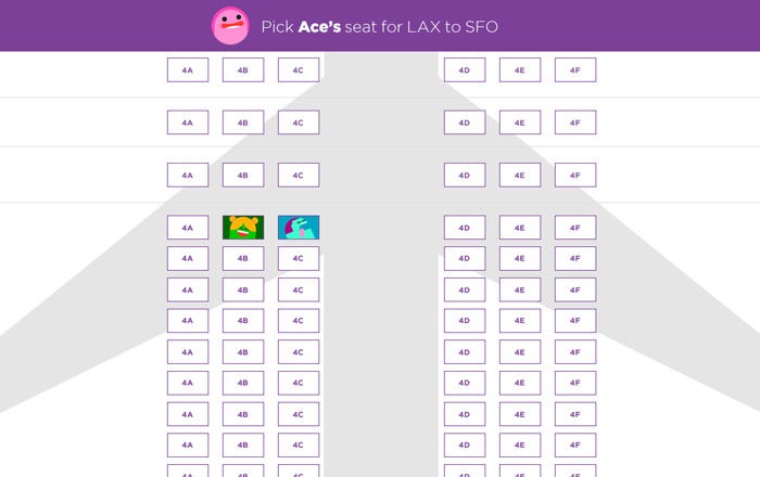 Virgin’s seat selection feature with what I’ve been calling “blob monsters” (source)
Colorful monster avatars were used as defaults in the now defunct talk.to messaging app. I also found a few older plugins, like monsterID and wavatars, that can currently be used as Gravatar defaults.
Talk.to default user icons (source)
Ideas for when to use: Colorful monsters and aliens are a really delightful way to increase engagement and give personality to comment threads and mundane tasks. If they incorporate brand elements, it’s a smart strategy to connect company identity to something fun and memorable, which can have a positive impact on customer loyalty. However, if your goal is to get people to upload their own photos, you might run into the same problem as you do with animals; these little monsters are just too cute to replace with an image of my own face.
Brand-related mascots
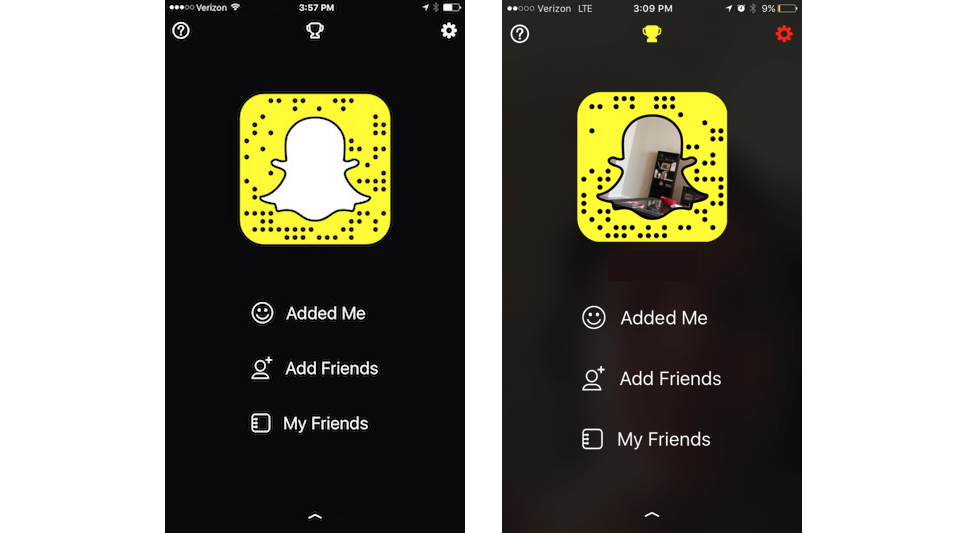 Snapchat empty state
What is it? Using a non-human brand character in a user profile empty state.
Examples: The best example I could find of this is the Snapchat ghost, which is what appears as the user’s profile image before they add their own. Even after they add an image, the avatar retains the ghost outline. The Snapchat profile image is extra creative because it doubles as a functional QR code, which is a common way for users to add each other as friends in the app.
Ideas for when to use: Using a brand mascot is a great way to carry over your brand image into the product and add some personality to the empty states of the experience, while staying away from strictly human shapes.
Brand Colors and symbols

What is it? Using imagery and colors from your brand palette to create unique identifiers for users.
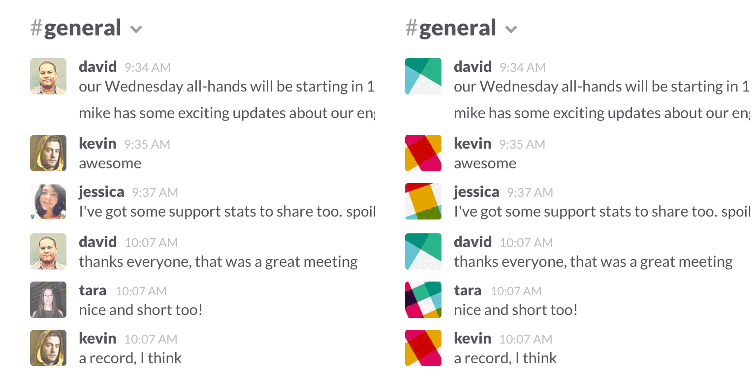
Examples: My favorite in this category is Slack. For users without a photo, Slack uses cropped variations of their logo at different zoom levels. This creates a variety of unique, colorful avatars that still allow users to visually organize comment threads.
 (Source)
Gravatar’s default is their logo on a blue background, which can get annoying to see repeated all over a comment section. Luckily, Gravatar has integrations in the form of identicons and monsterIDs, which Wordpress sites can choose from as their default.
Ideas for when to use: This seems like a good option when you want on-brand imagery that encourages photo uploads, since the Slack logo is certainly not a very personal identifier. The unique variations of Slack’s default help these avatars still feel useful in message threads, but not personal enough to discourage photo uploads.
Memes and pop culture
9gag’s random avatar generator
What is it? Unique pop culture images and memes.
Examples: 9gag is the definite trailblazer in this category. Their profile settings encourage users to find a randomized photo or meme, usually something along the lines of a celebrity making a weird face or a funny looking animal. Many users opt for one of these pop culture images, which plays nicely into the goal of 9gag to showcase funny internet gifs, memes, and videos.
Ideas for when to use: Since people talking on public message boards might not always want to display their actual likeness, random pop culture images can provide some anonymity as well as tie into the fun vibe of sites like 9gag. This approach is on brand and still helps organize comment sections, since each user still has a somewhat unique avatar.
Final thoughts

Making communities inclusive can be hard work. Even just deciding on an avatar style takes thoughtfulness, research, testing, and iteration, and is only a small step towards the larger goal. But these small changes are a part of what makes the work we do as designers meaningful, and has the potential to create delightful experiences that impact users in the virtual and real world.
So if you’re ready to design better avatars, keep this in mind:
- Remember that it’s worth it. Small acts of inclusion can make a large impact.
- Be creative. While the generic answer often seems easiest, it’s usually not that effective.
- Think about context. Your avatars still need to solve a core problem for your users and business, and understanding that problem can help you narrow down your design choices.
Extra reading
Anonymously male: Social media avatar icons are implicitly male and resistant to change
Effects of Avatar Race in Violent Video Games on Racial Attitudes and Aggression
When He Doesn’t Mean You: Gender-Exclusive Language as Ostracism
Identity, Avatars, Virtual Life - and Advancing Social Equity in the ‘Real’ World